Store design
Inside the visual merchandising perfection of Loly in the sky
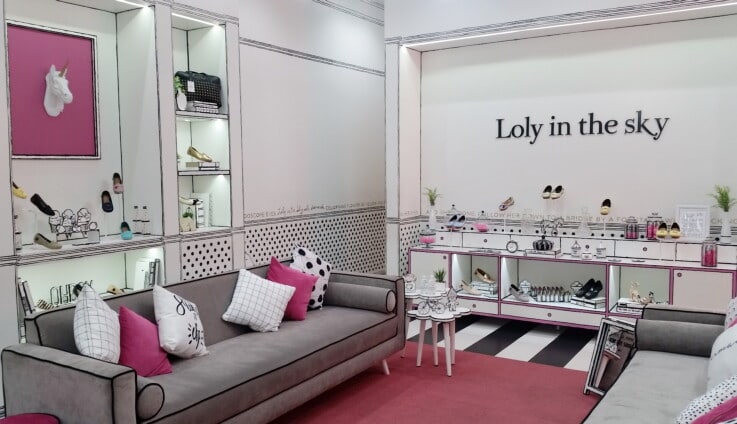

Sometimes you just come across a store that ticks all the boxes. Loly in the sky is a Guatemalan handmade shoe and bag brand which has perfectly translated its cute pink-and-white pop art style into gorgeous offline spaces.
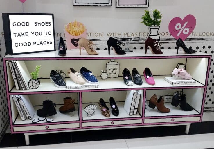
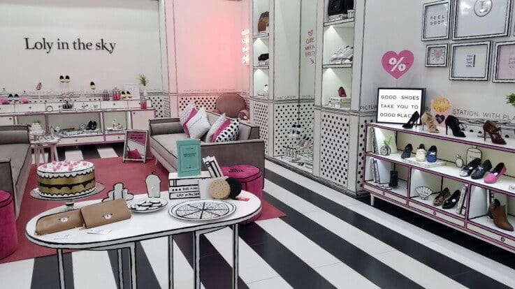
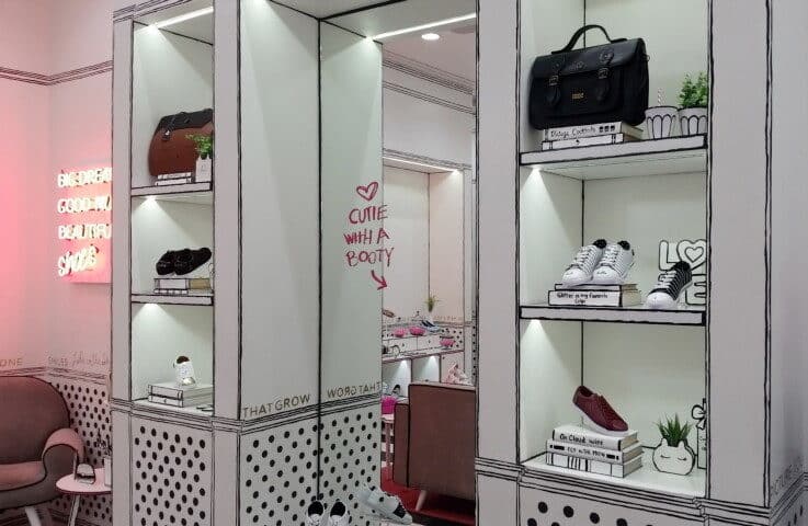
We just love how it has made all of the fixtures, tables and even sofas look like they’re from a comic book. Even the walls have the same thick lines and dots effect which gives the space an almost unreal feeling.
This is carried over into the visual merchandising. Shoes and bags are displayed on comic-style books with cute titles. There are 2D pop art ‘homewares’ like clocks, plant pots and telephones displayed around the space.
Loly in the sky has even written cute inspirational phrases from its branding and website along the walls. Why not? When you treat the whole store like a literal canvas you can put your brand into all of it.
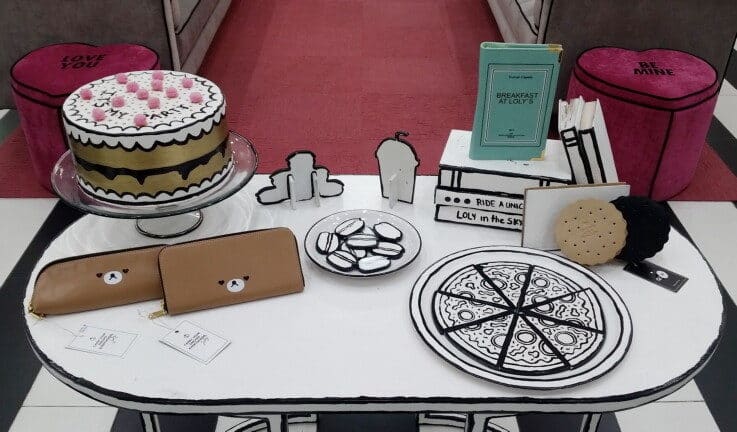
The space feels a lot like you’ve stepped into the front room of a super stylish comic book character. There’s a relaxed vibe with plates of pretend pizza and cake dotted about the place. It’s a space you’re happy to spend time in and just wander about and take in. It’s not pretentious. It’s just perfectly pitched.
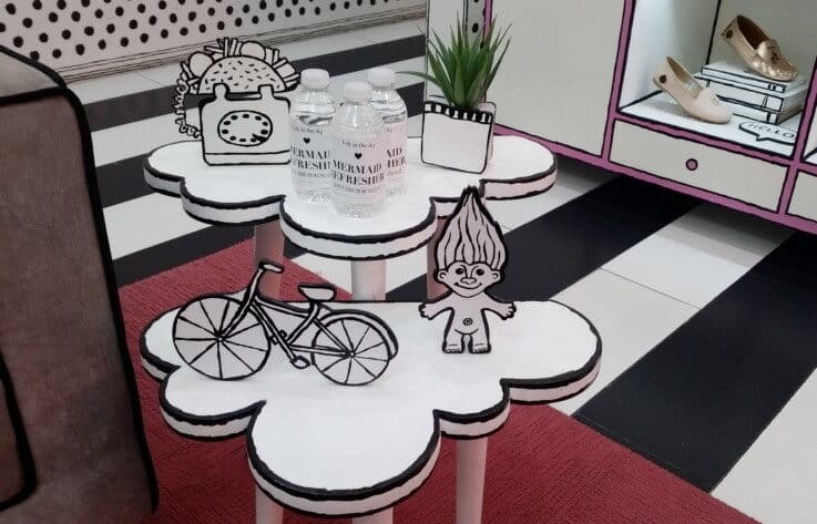
Loly in the sky even has branded bottles of water available for customers. Again, they keep that same company branding by calling them Mermaid Refresher instead of water. A bit cutesy maybe, but perfectly in keeping with its vibe.
It’s such an easy win for the company as well. It’s a value-added way of getting your brand in front of someone. Even if they don’t buy anything if they take a bottle of water away then it’s a memory of the brand. It’s building that connection.
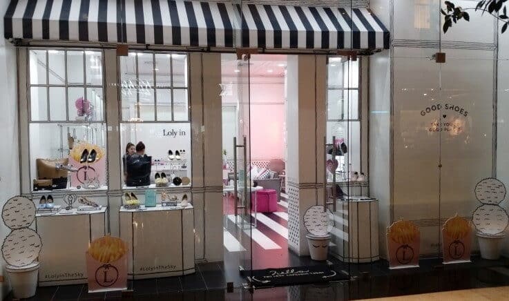
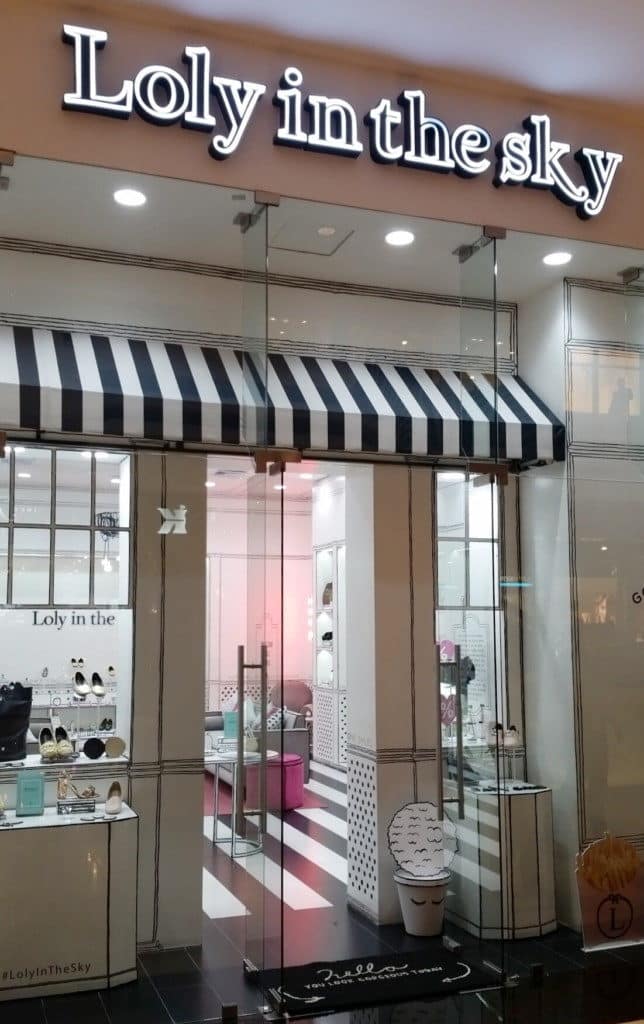
What’s really cool is that the shopfront is actually designed in the same way. The frontage and window displays sit behind the ‘real’ shop front which is just plain glass. It gives Loly in the sky the perception that the store really is this cute little comic book world. You get a sense of the brand before you even step inside. And you can’t help but notice it as you walk by.
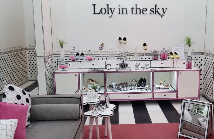
By keeping it white and black for the most part with pops of pink, Loly in the sky ensures that the space feels classy, not cartoony. The company wants women to feel special. It wants its products to express the dreams of its customers. Its stores do just that. And they’re a great example for the rest of retail.