Store design
How to Improve Your Visual Merchandising
Did you see our pick of the 50 best uses of visual merchandising in retail? How does your store measure up?
Here we explore some of the ways you can improve your own visual merchandising and achieve similar results, and sales success for your own store.
What is Visual Merchandising?
A quick visual merchandising 101: visual merchandising (VM) refers to the visual elements that can be adapted, re-designed and re-arranged to entice customers in store, and maximise sales. It is not the interior store design or architecture. Examples of visual merchandising elements include layout, signage, lighting, props and window dressing.
Great VM should seamlessly blend clear storytelling, boast a strong brand identity and offer an exemplary and intuitive customer experience. No easy feat but luckily there’s a toolbox of techniques and tactics to help you get there.
The magpie effect
Today’s ‘showrooming’ culture means an increasing pool of customers heading to stores for inspiration and ideas, over specific and planned purchase. Research suggests that 50% of purchases are an impulse buy or unplanned purchase (Dunne and Lusch).
With this in mind we can start by always placing the newest and most expensive items at the front of the store. Think ‘want’ over ‘need’ first – if they ‘need’ something, they’ll pick that up anyway. You should also rotate existing inventory, to ‘refresh’ the product in the minds of returning customers.
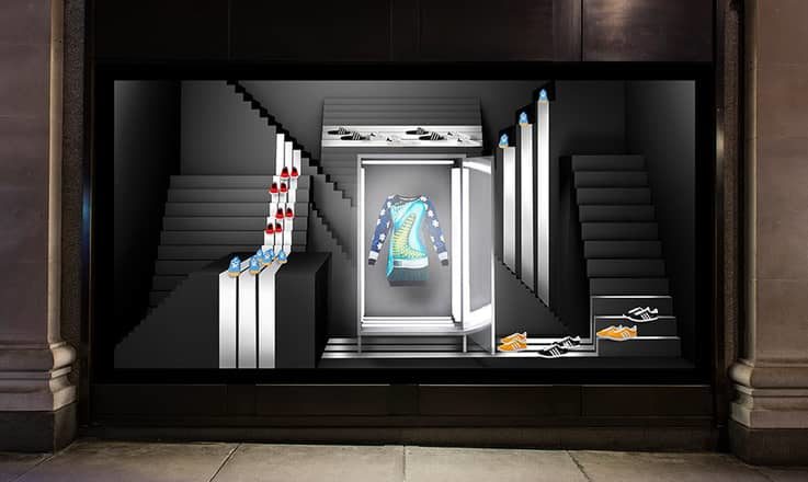
Windows
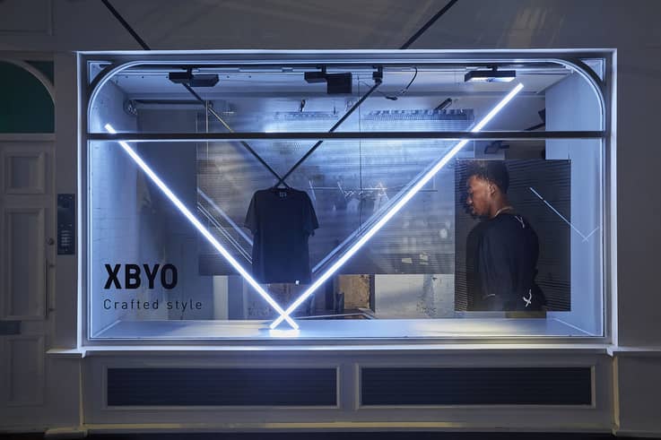
This leads neatly into windows which should be the place to celebrate your new or superhero product. This is your playground for creativity, and the first storytelling contact point for your store.
Examples are numerous – look to department stores like Selfridges for best-in-class examples, but remember – you don’t need to have an infinite budget to make an impact. If in doubt, your golden rule is to keep it simple but impactful. Avoid too much visual clutter so it’s easy for the customer’s eye to follow. For similar reasons, steer clear of too many colours, opting for a handful of contrasting colours. Add one or two focal points – a mannequin, eye-catching typography, a key visual, a considered storytelling prop such as this adidas XBYO store window by Studio Xag.
Context
Every aspect of your business will be paying into consumer insights – you retail store is a chance for them to step into your world, designed for them.
With this in mind, a great VM tactic is to contextualise your products by lifestyle. Dover Street Market do this brilliantly styling new season pieces with the right selection of accessories, art, books, fragrance and homeware, acting as (shoppable) props. Anthropologie is also a great example – a well placed scented candle, silk scarf or vase can instantly increase basket spend.
Grouping as a concept, is another golden rule. Identify a quality that acts as a hook for your ‘group’ theme. This could be products belonging to a specific collection or an enticing colour palette to increase up-sell. We recently featured Kochhaus Berlin who offer a deliver-to-door meal subscription, and communicate this in its grocery store by innovatively displaying product by recipe, rather than food group.
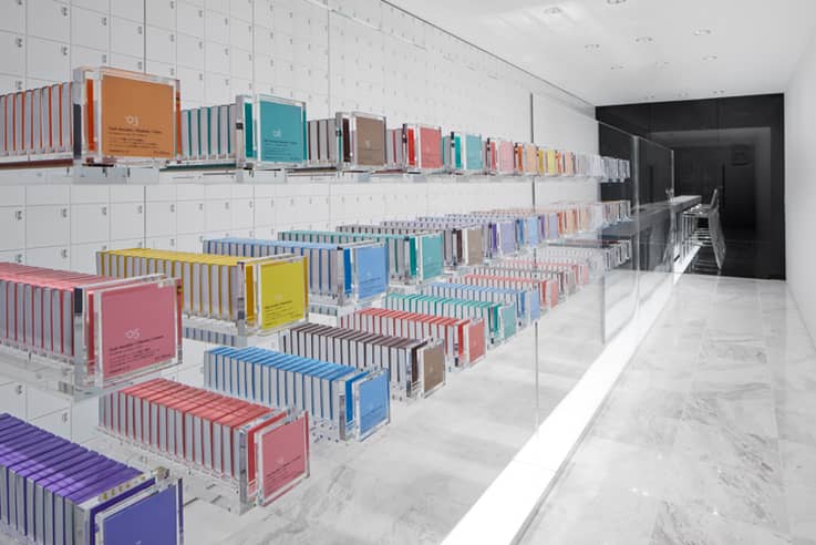
Colour
In terms of theme, generally colour is a great go-to visual hook. We could wax lyrical on colour theory but it goes without saying, colour has an emotional impact on your customer. Red and orange are warming and sensuous, blue and green are calming and soothing whilst red+black+white are rumoured to be an alluring combination at retail. Some research suggests that over 60% of a customer’s purchasing decision is based on colour.
As a golden rule, if you’re getting to grips with colour, opt for a solid-colour background to allow your products to pop against it – check out these chocolate bars at the BbyB Chocolate Shop, designed by Nendo. Unless it relates to your storytelling, avoid monochromatic displays as the eye quickly fatigues. And of course, colour makes for a fun and eye-catching grouping theme, as exhibited by Papersmiths.
UX
So we’ve looked at psychology, now the physiology – think like a human.
Rule number one – products should be showcased at eye-level and in reach. Rule number two – stagger the height of your product, to avoid products blurring into the background. Rule number three – ‘the rule of three’, a classic VM principle where you’re more likely to capture the customer’s attention when it’s triggered by imbalance (such as an odd number of objects).
An example of this brings us to rule number four – The Pyramid Principle with one clear focal point (such as a mannequin, then lower-level product staggering beneath it. The final rule is – create intrigue with an odd object, unexpected props
For example, this Urban Outfitters setup has product layered at different levels across the table, cabinet and backboard, (three objects you might also note). It also features props that stir curiosity.

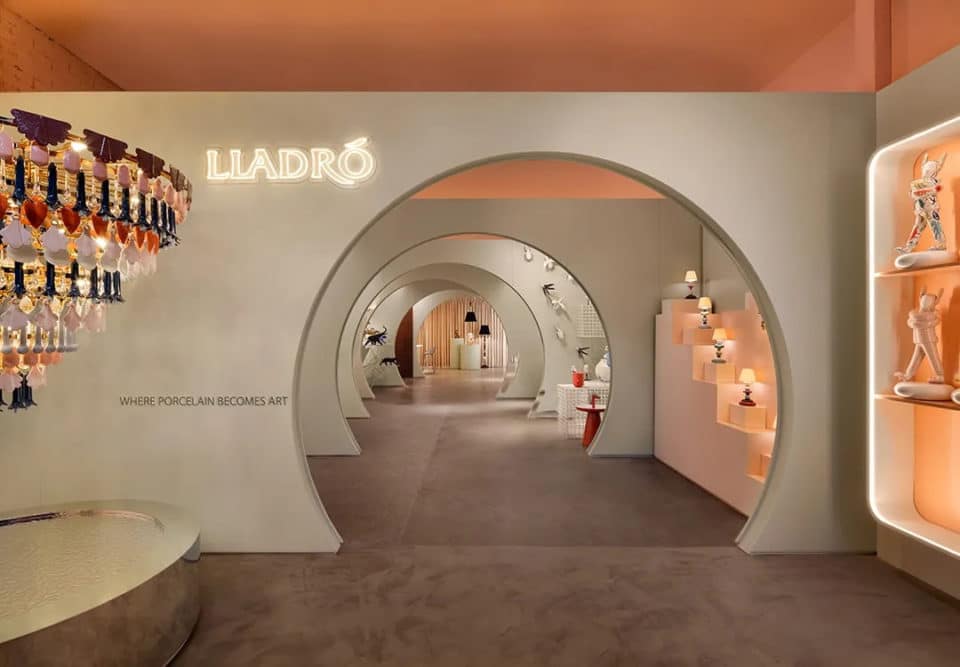
Illumination
We’ve all experienced the off-putting effect of poor lighting. According to Shopify, customers spend more time in stores that have warm lighting and that the average sales of per customer increased by 1.93% when a dynamic lighting installation was introduced.
‘Primary’ lighting is the general illumination of your store, products should never be in the shade and spotlighting should be used to highlight lower and upper shelving if required. The CARIN flagship store by NiiiZ Design Lab is beautifully lit. Of course, it benefits from natural lighting but crucially, each product is allowed to shine.
Accent and ambient lighting can be useful tools to focus a shopper’s gaze. Contrast helps make perception easier. The Body Studio at Selfridges utilises different lighting to create different moods for its sportswear, sleepwear and underwear sections. The Domicile Store, Tokyo makes use of dramatic spotlighting on its hero display.
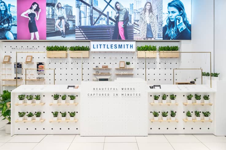
Signposting
Obvious, but often overlooked is signage. Confusing wayfinding (or lack of it) can fire up frustration and prompt a swift exit. Key wayfinding signage should be large and legible from the front of the store. Key promotions and instructions should be clear and concise, such as this instructional one-liner from custom jewellery brand Little Smith at Topshop.
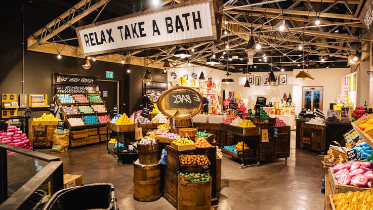
Lush offers a great example of signage well done using a hierarchical system. Key campaign messages are called out on feature signage; product categories are scrawled out loud and clear, then individual products are highlighted with smaller signs. Furthermore, they’ve made a design feature of the typography which carries across every aspect of its product packaging and communications.
As you can see VM isn’t an impenetrable mystery. With the right approach and tools at your disposal, any store can create attractive visuals. And with that comes customers.
For more inspiration, catch-up on these retail design insights from 17 top experts – what will stores look like in 2025?
See the latest trends for yourself by joining us on a London retail trend tour.